As designer Markham Roberts explains in his inspiring new book, Notes on Decorating, “There are thousands of moving parts that need to come together cohesively for a successful outcome.” In his first book he addressed the basics of design (although I would hardly classify anything in his interiors as basic) and now he features all those aspects that help to make his work so memorable – from sussing out the client’s deepest desires to the practicality of challenges and solutions, the crucial addition of layers and the final touch of something unexpected.
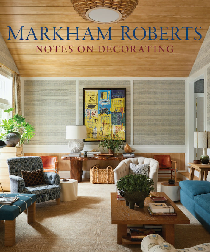 It is all these considerations that make Markham’s rooms stick with you, not only for their beauty and comfort but their extraordinary symbiosis of client, place and originality. One such project has a chapter all its own – an extraordinary home on Nantucket that you may have seen when published in Architectural Digest. The chapter, entitled The Fates, is not only insightful but anecdotal and full of humor (be sure to check out “Markham’s Travel Needs” in the introduction). Knowing Markham and having also met his “smart, funny and naughty” client here on Nantucket, it is my delight to be able to share more about this very special island home including some unpublished photos and behind the scenes info!
 Q: As you say in the introduction of your new book, decorating is a complex business and process and I can’t think of anything much more complex than decorating a large house from scratch on this small and often inaccessible island 30 miles out to sea. How many years and trips did this project involve?
MR: It was about a year and half of work – on fast track and I spent a lot of time there for the install, which had to be done in many phases, given all the different vendors and the sheer amount of what had to come into the house. I remember the first time I visited the site when I came on board, and it was January in the year where they had ice waves on the beach. I don’t think I have ever been colder than that day in a house that was an open construction site.
 Q: Although your client gave you free reign to design it all, were you given any sort of directives to at least start the process?
MR: I knew it had to be a house both for the client and for her larger family. We had to make it comfortable for all, logical and practical for the different needs and we had to deal with the light and how it changes seasonally, since the house is used more than just for the summers. We made summer slipcovers and summer and winter curtains and pillows to give the house a different feel when the light changes as the days get shorter. That was super important to the client, but other than that, she didn’t give much direction. I think she wanted to see what i would come up with for her, and we fortunately have similar tastes, so we were able to work quickly.
Q: It seems to me that this project was an act of elaborate acrobatics – How do you balance a very particular sense of place like Nantucket with a broader design scheme and keep what is essentially a beach house (albeit a large one) from becoming a formal decorating power play?
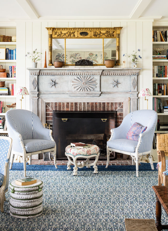
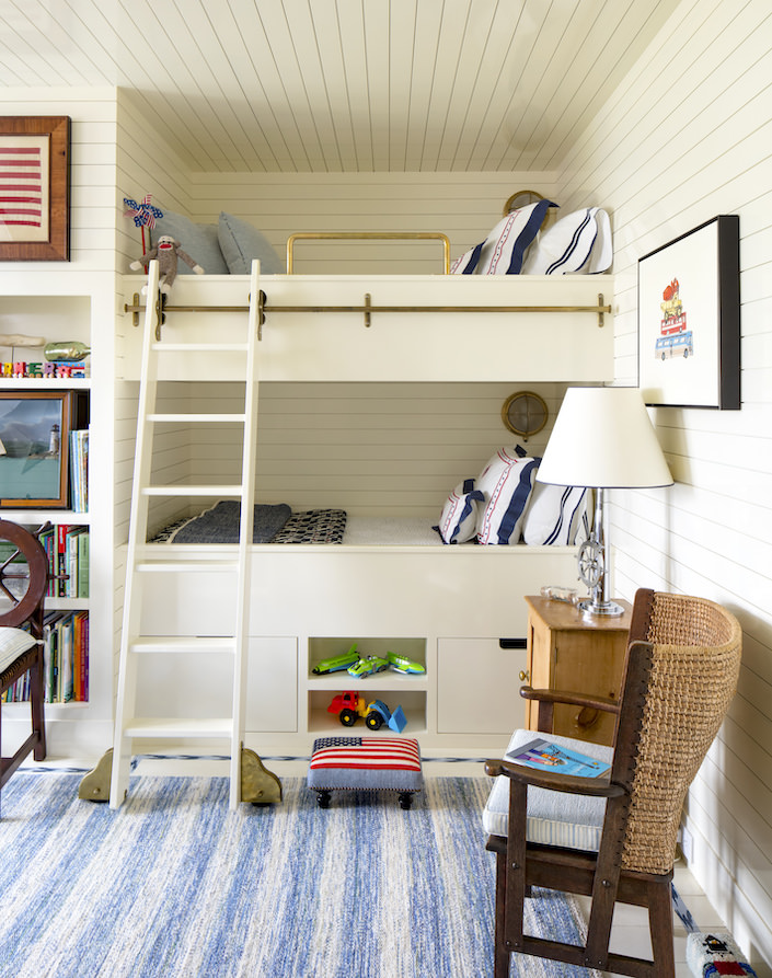
MR: With the client’s exceptional art and important collections of antiques and decorative arts, I carefully chose more casual materials and patterns and tried to arrange furniture in comfortable, less rigid ways – all to bring down any fanciness that might easily take hold when dealing with possessions like these. The client has a terrific sense of humor and enjoys her family and friends, and it was important to her to make the house inviting.
 Q: What was the key to incorporating so many Nantucket themed collections in the house (baskets, Sailor’s Valentines, bird carvings etc) without seeming too contrived or expected?
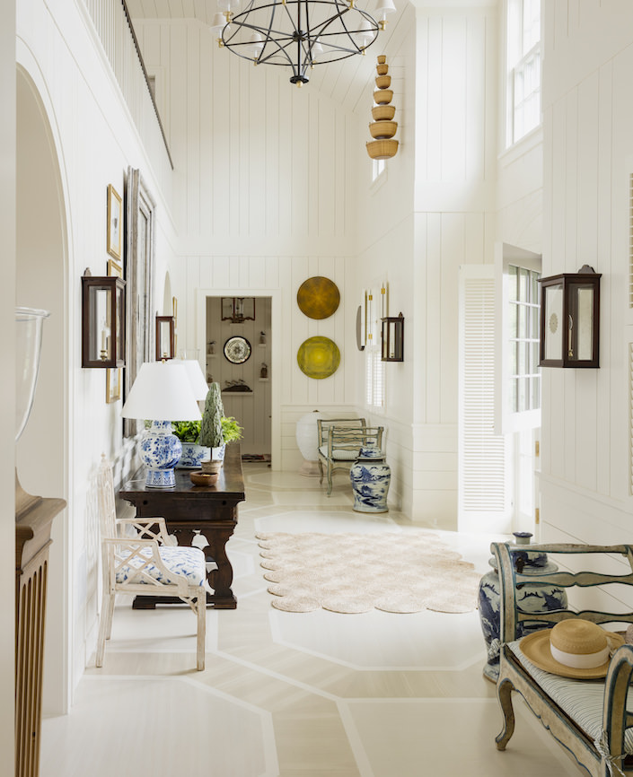
MR: Things like that are undeniably charming, and the client had a lot of it, which I tried to use in different ways. For example, we had a number of complete sets of Nantucket stacking baskets, which fit into each other like Russian dolls. We chose to hang the two antique sets up high in the entry hall on the walls as sculptural art, and to use the newly made sets around the house as cache pots and for flowers. The antique set is out of reach and therefore protected, and the newer ones are on hand to use. We did use sailor’s valentines too – they are hard to resist, but they live in the granddaughter’s bedroom where they compliment her pink and lavender scheme or were used in bathrooms as they can’t be damaged by moisture.
Q: I can’t even imagine how you began to sort through and choose from your client’s enormous collections. How did you even start?
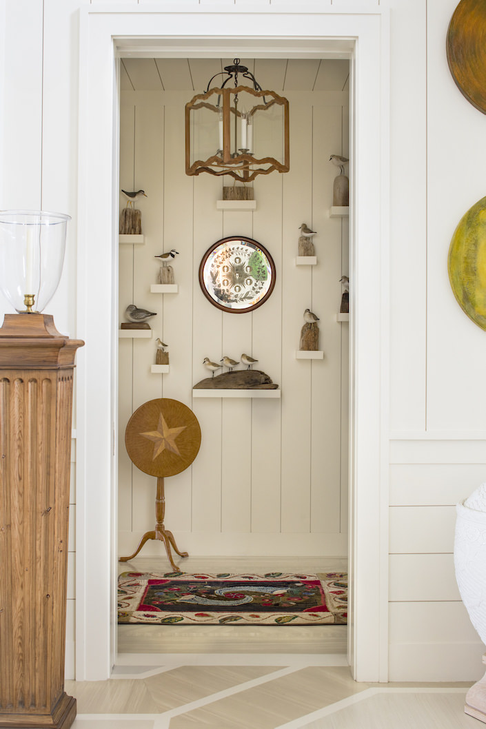
MR: That was the challenge of this job, assessing and finding use for the client’s many things. We had to edit pieces and think of different ways to use things, so that they felt new to her and would fit into this new house. Take the large collection of carved aquatic birds; instead of displaying on tables and in bookshelves (which would have made us have to give up books) we made special brackets and hung them in groups on the walls in two areas, creating flock art and adding a different visual interest to those rooms.
Q: What was the key to presenting these collections in an unpretentious way so they charm rather than show off.
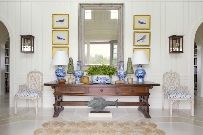
MR: I guess it was more of an overall concept, rather than a conscious decision, that both the client and I appreciate less formal things for a house like this. Neither of us gravitates naturally toward fancy or precious fabrics and trimming too much. In making decisions like using the different designs of wood planking as the architectural backdrop in the many areas of the house, painted crisp white, we set her things off and highlighted them against a simple backdrop, or at least seemingly simple. Had we hung the important 18th century Indian watercolors of birds of prey and the collection of colorful chakra paintings by Julia Condon in the entry hall, on fancy glazed plaster work walls, it would have made a very different feel – one i think not so welcoming.
Q: What are some key components that helped you walk the line so successfully between highly sophisticated and bespoke design and understated style?
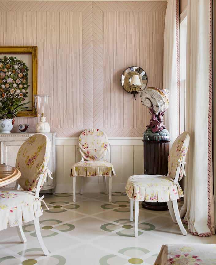
MR: Take the dining room wall upholstery for example. I wanted to create the effect of paneling with the direction of the ticking stripes, and while this is an incredibly complicated and precise job of lining up every stripe perfectly, and working it out with the architectural design, i wanted it to feel simple and not be obvious. Using mattress ticking helped bring any formal quality down and seem less fussy and keeping the overall palate in the room faded or subdued, it allowed the interesting pieces in the room to really shine.
Q: There is a strong tradition and history of craft on the island. How did you find so many of the people to work with locally?
MR: My client has been going to Nantucket for decades, and she already had a great affinity for the local crafts so I was happy to learn from her experience and relationships. We got to work with Hilary Anapole to weave custom rugs in the great loom tradition and there hasn’t ever been a time I have visited John Sylvia’s lovely shop at the bottom of Main Street and not come away with something special.
 Q: You kept the entry and halls clean and bright with the white millwork and Bob Christian’s elegantly neutral painted floor. What was that thought?
MR: The room is double storied with a gallery of the stair landing above. It has high windows and is interestingly shaped with the roof lines. We wanted to play with the wood planks in their directions on different parts of the crisp white walls, and to set the walls off against bob christian’s handsome floor. Both treatments were done to visually set off all of the different pieces in the room – the old english refectory table, Dutch mirror, Indian watercolors, antique Nantucket stacking baskets, the provincial painted and rush seat benches, Julia Condon’s artwork, and the Chinese export and delft blue and whites. There’s a lot going on, so I wanted to balance it with the simplicity of white walls.
Q: You are known for your brilliant use of color and pattern and this house in particular has a panoply of both. Any advice on how to achieve the mix without culminating in a dizzying effect?
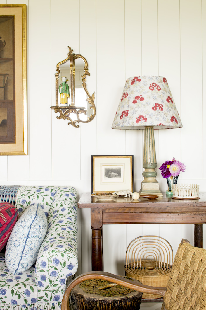
MR: Put it together and see how it works. If it looks bad, scrap it and try something else. and keep in mind that things don’t have to match and probably shouldn’t. It’s fun to experiment with color and with pattern play.
Q: While a blue and white color scheme may seem an obvious choice for a Nantucket house, you managed to temper any reference to it to feel appropriate yet not overwhelming or obvious. Any tips?
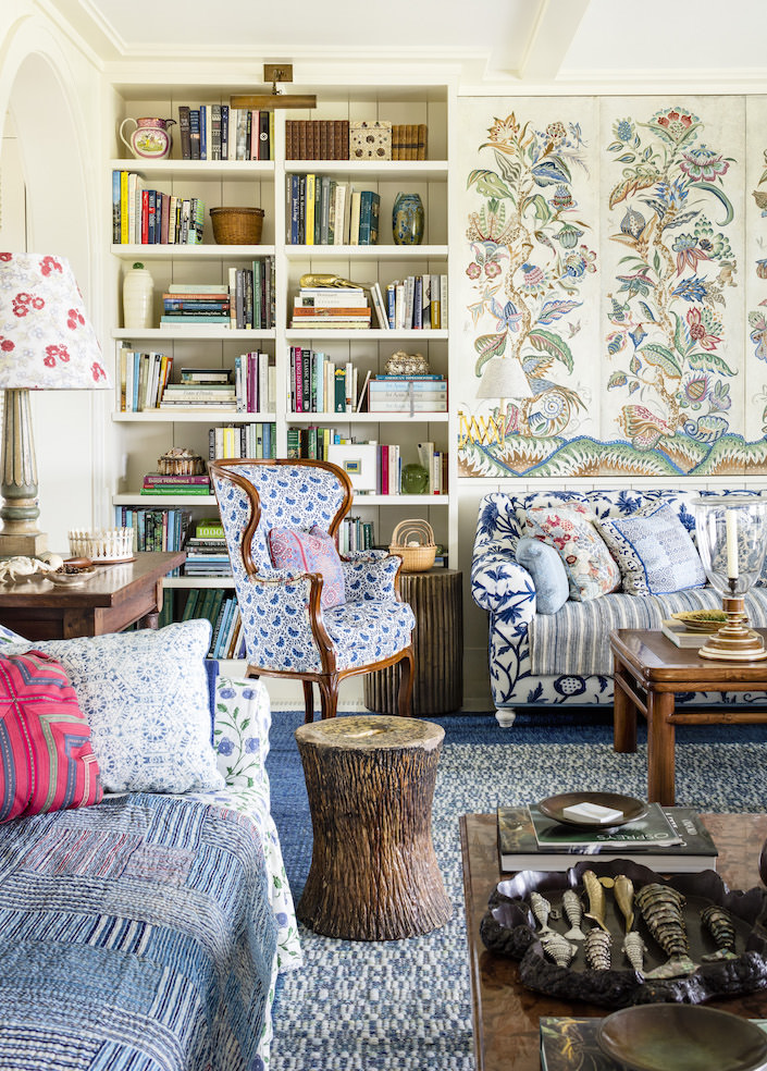
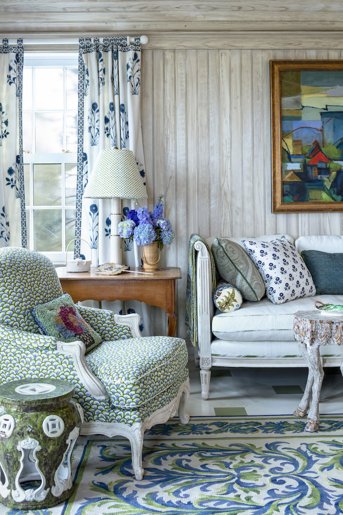
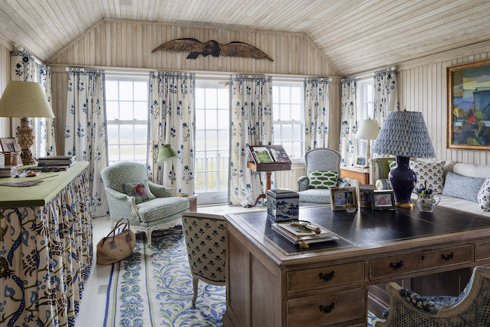
MR: I don’t really think of this house as blue and white, but when I look at it, there are four rooms that basically have schemes of blue and white. Again here, I never like things to match, and I think you have to throw in contrasts so things don’t get boring. One of the rooms has burnt orange and Pompeian red contrasts, another has all the greens and browns and golds of all the palissy ware hung on the walls, and the client”s bedroom has lovely pinks, both soft and bright to go with her paler blue and white scheme.
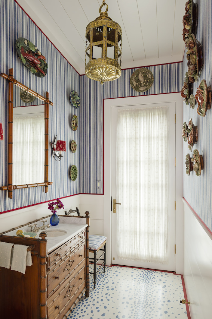 Getting to work with a client like this who is funny and smart, loves decorating, has superb things, and most importantly who wanted to really indulge my creativity was a great experience. I think the result is a house perfectly suited to her, and that is its success.
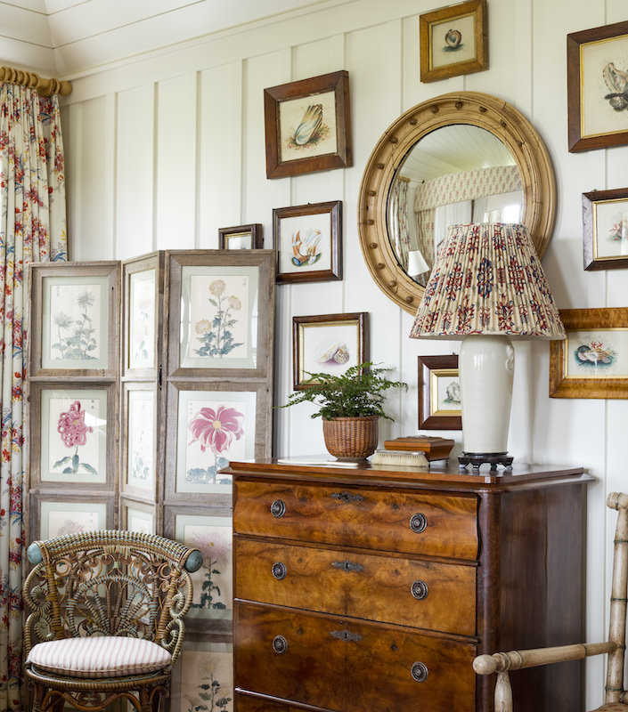 all photos by Nelson Hancock
Thank you Markham – it’s always a treat to chat with you and hope to see you on island sometime soon!


